These days, anyone can write a blog.
Still, it is not as simple to elevate that blog to a higher standard.
No matter if you’re using the platform to make money, share your interests with the world, or just have fun online, everyone is looking to stand out from the crowd.
But what is the best way to do that?
There are many different strategies you can follow to make sure you are running a high-quality blog, but there is one thing that makes any content stand out.
That one thing is adding visuals.
If you incorporate interesting and attention-drawing images into your posts, you will manage to generate interest in your readers.
With carefully chosen visuals, you can get a lot of traffic and your blog will grow more and more each day.
Wondering how to use them in the most effective way and draw in a crowd of people?
Read on to find out.
Contents
Why you need visuals
Before deciding on the type of visual, you first have to know what drives your audience to visit your blog.
Good content is what gets people in, but it’s not necessarily what keeps them around.
In fact, you might be surprised how little of your content is actually read.
According to research, average users only read approximately 20% of a text on a web page, while only 10-20% of readers read the post entirely.
So, if they’re not reading all of your content and there isn’t anything else to keep their attention, they will quickly lose interest and leave your blog.
That’s where visuals come to the rescue.
When you look at some facts about visual content, it’s easy to see why it is an essential part of any blog.
- People’s desire to read content increases by 80% when they see colored visuals.
- Posts with images produce 180% more engagement.
- 65% of people are visual learners.
- Human brains process visuals 60,000 times faster than text.
- 91% of people prefer visual content over written content.
What kind of visual draws the most attention?
Not all visuals are the same and not all of them will fit your blog and the content you’ve written.
The type of visual you use should depend on what you want to convey to your audience.
The most popular types of visuals are:
- infographics
- photographs
- videos
- charts and graphs
However, images that aren’t as popular and widespread can still draw a lot of attention to your blog, such as gifs and gifographics.
If you want to use visuals to your advantage, below are a few tips you should follow.
Choose your main colors and fonts
It’s important to carefully decide which colors and fonts you will be using.
After you’ve chosen a color scheme for your blog (it would be best to use 2 main colors and 2 secondary colors), and the fonts you like, you’re ready to pick out visuals.
The visuals you choose for your blog should match and complement your color scheme, and look aesthetically pleasing.
Nobody wants to see clashing and unappealing colors that will divert attention from the written content.
Create Fun Infographics

Image by 200 Degrees from Pixabay
Infographics are among the most popular visuals on the internet because they are easy to read, interesting, and provide the minimum amount of needed information while being fun and colorful.
This user-friendly visual helps you pinpoint the most important parts of your content in an aesthetically pleasing way.
It offers relevant data to your readers in the form of keywords, lists, and summaries of your written content.
Another advantage of infographics is that they can be shared on social media platforms and help bring more traffic to your blog.
Don’t be afraid to use GIFs

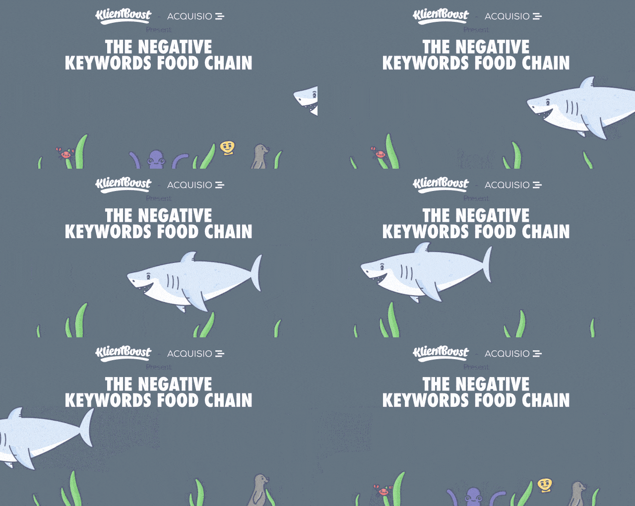
Client Boost example Gifographic
Not a lot of bloggers dare to use GIFs (Graphic Interchange Format) because they think their blog will look unprofessional.
However, this is actually a misconception.
In fact, if this visual is used correctly, you are more likely to display expertise.
Since not many bloggers use GIFs, it is an excellent opportunity to make your content stand out from the crowd.
These fun moving pictures are all over the internet and people enjoy them very much.
Therefore, if you use GIFs to enrich your content, people are more likely to have a positive reaction to them.
GIFs can also:
- convey emotion
- show that your business keeps up with the latest internet trends
- show the human side of your company.
- be shared on all types of social media
Create a gifographic

https://images.app.goo.gl/rMzsHEU9P2VXZMwp8
As we’ve already said, infographics are among the most popular visuals online.
On the other hand, gifs are simply fun to look at and are quite popular, especially among younger readers.
So why not combine the two and create one of the most powerful visuals ever?
The gifographic combines the colorful and informative nature of an infographic with simply-animated GIFs.
That’s what makes gifographics so appealing.
This format isn’t too widespread, but people find it much more enticing and interesting than a regular infographic.
Therefore, it’s more likely to be shared.
Choose your photos wisely
Photos should be an integral part of your blog.
You can use stock images, your own photographs, or hire a professional photographer to get high-quality photos.
After all, quality content requires quality images.
Even if your written content is outstanding, a badly chosen image can ruin the entire blog post.
Here are some key tips you should follow when you’re choosing photos for your blog:
- The images should be of high quality and with good resolution.
- Image file sizes should be optimized for the web.
- What’s presented in the image has to match your written content.
Add videos
One of the most powerful tools visual content marketing has to offer are videos.
They break up your content and give your readers time to process the written information you’ve presented to them.
Images have the same effect, but videos do it more efficiently.
Also, as it takes more time to watch a video, whereas you can only glance at a picture, it is more likely your audience will spend more time on your blog.
Videos are easy to add and they break the monotony of written content nicely.
If you have your own YouTube channel, you can add videos from there and self-promote at the same time.
If not, make sure to use videos that fit in with your content and be careful about copyright laws.
Use charts and graphs for data-driven content

Image by StockSnap from Pixabay
Nobody will read out everything there is to say in a text post if you have a lot of information in your content.
To make things less complicated, create charts and graphs to help your audience comprehend the data presented.
Make sure that your graphs are well-researched and always cite your sources.
If you fail to do so, you will lose all credibility and your readers won’t trust you.
What’s more, if you lose their trust, you will also lose traffic to your blog.
Therefore, be smart and careful about what you post online.


