Imagine spending hours writing your blog posts or spending thousands of dollars to outsource blog writing only to get no traffic.
Many things could be the culprit, but one of those is poor blog design.
Fortunately, that’s a problem that you can fix.
Read on to learn why good design is vital to your blog.
Contents
What Is Blog Design?
Blog design refers to the visual appearance of a blog or website.
It covers the colors, fonts, and layout of blog posts, images, and other blog content.
You can use a template or theme to create a simple blog design.
However, you may want to customize the theme or template to develop a design that you want.
What Makes a Good Blog Layout?
Things that make for a good blog layout include:
- Focus on the content
- Easy to navigate
- Easy to read
- Well organized
- Use of categories and tags
Blog posts should be easy to find and read.
Many blogs include a search bar so that visitors can find exactly what they need.
It’s also important to include a list of categories to help readers narrow their search.
11 Essential Pages Every Blog Should Have
One of the most common questions I get from beginning bloggers is “What are the essential pages I should have on my blog?”
There are no hard and fast rules that a blog should have all these pages mentioned.
But here’s a simple checklist about essential pages blog should have to get you started.
1. About Page
It is the most visited page for almost every blog. So, it’s important to make this page compelling. You can add a few sentences introducing yourself and your team (if you have any), mention the purpose of your blog, tell a bit about your mission and your target audience.
2. Contact Page
A contact page is a quick way for people to get in touch with you. It’s a place to list your contact details; some blogs have a contact form that makes it convenient for a visitor to get in touch.
3. Products/Services
The primary objective of starting a blog is to entice visitors to become customers. The purpose of a Products/Services page is to familiarize your visitors with your core business offerings. This is where you can list your products and services.
4. Subscribe Page
The purpose of a subscribe page is to get followers and subscribers for your newsletter. It is perhaps the single most important activity in blogging. With WordPress Subscribe plugins, you can create high-converting subscribe forms with beautiful templates to increase your subscribers.
5. Write for Us
Most Bloggers are constantly looking for guest posting opportunities. A ‘Write for Us’ or a ‘Guest Posts page’ informs people that you are accepting guest posts, and lists guidelines for the same.
If created carefully, this page can attract wonderful writers and ensure a regular flow of quality content to your site through guest posting. So you can consider this page as one of the most essential pages blog should have.
6. Archives Page
As a rule, your most recent blog posts are on top, and your older blog posts are pushed down every time a new blog post is published. To make your blog posts easily accessible, you can add them to an archived page. This helps visitors find your older posts more easily.
7. FAQs
An FAQ (Frequently Asked Questions) page is a quick way to find out some of the most common questions of your readers. It is the section where you can address the most common concerns, questions, or objections about your business, products and services.
Most websites usually overlook an FAQ page, but a well-compiled FAQ page can reduce your bounce rate substantially.
8. Disclaimer Page
In addition to the general pages, there are a couple of legal pages that every website is required to have by law. A disclaimer is a statement intended to protect a business from legal actions. The disclaimer of your business will depend on the nature of your services or products you are selling.
However, commonly, you could include a ‘notice of risk’ for using a tangible product, limit your liability to intangible services, intellectual property, the content on your blog and protect the copyrights of all your original content.
9. Privacy Policy
Another important legal page to create is a Privacy Policy page. The key purpose of a Privacy Policy page is to reassure your visitors that all their personal information is lawfully being collected, stored, and used by you
10. Terms of Service
A Terms of Service page is a statement which outlines the rules that users must agree to while using a service, or a product, or any kind of intellectual property.
The main objective of a terms of service page is to legally bind users in a contract with you. It also should outline the consequences in case any condition is violated or abused. If you’re not sure about how to create a solid ToS page, you can consult an attorney.
11. Testimonials Page
You can have a page where you can integrate some client reviews and testimonials about your product.
Remember, word-of-mouth is still a powerful way to sell. Another way to show your worth is by putting up any awards or recognition that your business has achieved on your Testimonials Page.
People are always impressed with social proof and positive reviews about a brand. Especially when you are marketing your business online, it is important to display your credibility.
How Do You Create a Great Blog Design?
To develop the best blog design, you have to consider a few things.
First, if you aren’t a web design professional, look for a WordPress theme or template to help with the basics.
You should then customize the theme with your blog colors.
That way, your blog will be more memorable for readers.
Consider adding comments or share buttons to your posts to drive engagement for your blog.
After you create your first blog design, you can still improve it.
Take note of popular posts and categories, and use that to make sure you promote those posts within your blog layout.
What Are the Blog Design Ideas?
When deciding how to design your blog, it helps to get some inspiration.
Consider the following blog design examples to help create your personal blog.
1. Dribbble
Dribbble is a freelance design marketplace with a blog on its site.
Here’s what you should know about this blog.
What Are the Features of Dribbble Blog Design?
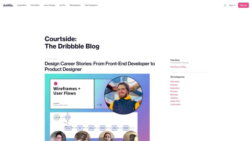
Dribbble is a pretty simple design blog.
We’re a fan of minimalism blogs, so this is one of our favorites.
You can see some of the latest posts in the main column, while the sidebar has links to blog categories and the Dribbble podcast.
The blog posts have share buttons at the top for social media.
While there aren’t any comments, that helps make the page design clean and minimal.
Which Niche Is Dribbble Design a Fit For?
The Dribbble blog design is a good fit for almost any niche.
If you want to have readers focus on the content, it makes sense to keep things simple.
You can use it for a design blog or almost any topic you’d want to write about.
Then, you can spend more time writing than on the design.
Is It Easy to Use the Dribbble Design?
Once you find a theme or template that emulates the Dribbble blog, it should be easy to use.
You don’t have to worry about dealing with tons of images or other clunky elements.
At first, it may take some customization to get the design just right.
But you shouldn’t have to edit the design much after that.
2. Spotify Design
Another simple blog with a fantastic design is Spotify Design, especially if you’re planning to run Spotify ads on the platform.
Consider what makes this layout so effective and if it’s for you.
What Are the Features of Spotify Design?
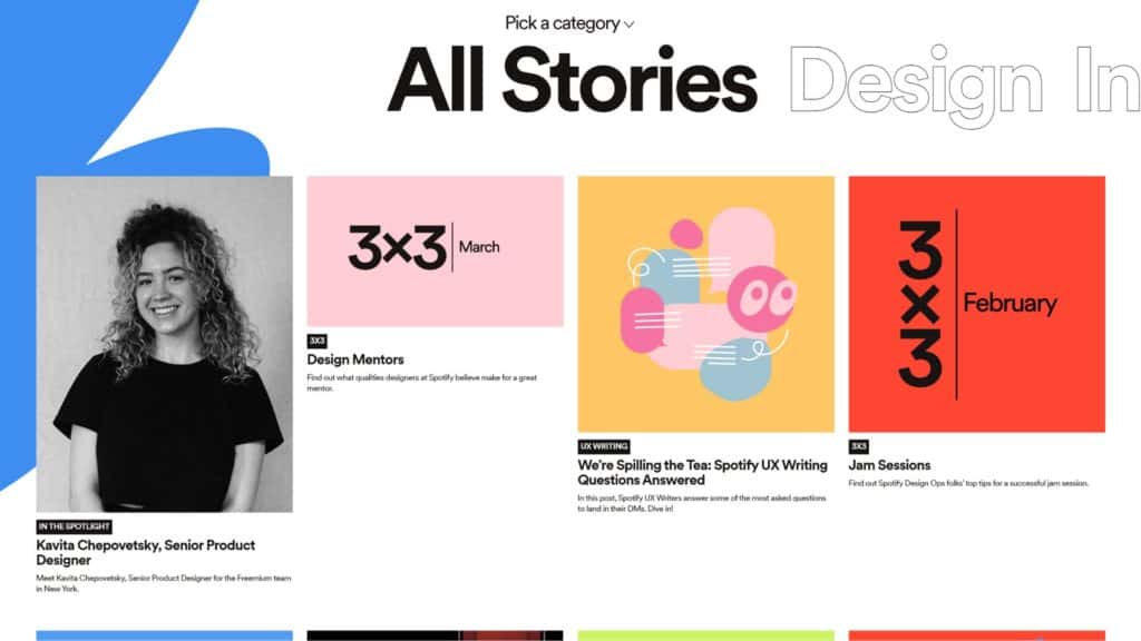
The Spotify Design blog just features blog posts.
It has rows of four posts, and you can click to view more stories after scrolling through the latest ones.
At the top of the page, you can choose a category to filter the posts you view.
That’s a great option for readers looking for something specific.
Which Niche Is Spotify Design a Fit For?
Spotify Design’s layout is a good fit for a blog that a business wants to use.
The simple design helps with content marketing by removing distractions.
It may not be the best option for websites that are just blogs.
You’ll need a bit more navigation to help people find posts.
Is It Easy to Use the Spotify Design Layout?
Using the Spotify Design layout can be easy once you find a similar theme.
You can customize it a bit to show as many posts as you want.
The ease of use can depend on the platform you select as well.
Some blog platforms have a bigger learning curve.
3. Frank Chimero
Frank Chimero doesn’t have the most active blog, but its design is worth reviewing.
You may find you like the look of it for your site.
What Are the Features of the Frank Chimero Blog Design?
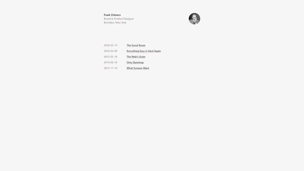
Frank Chimero’s blog is simpler than some of the other examples.
The blog is purely a text list of the posts that he has published.
You can see the date of each post, and the posts have hyperlinks.
When you read a post, you don’t have the option to comment or share on social media.
Which Niche Is the Frank Chimero Design a Fit For?
The Frank Chimero blog design is a good fit for blogs where images aren’t going to be a big thing.
For one, you can’t include a featured image on the main blog page.
While individual blog posts can support images, they make the post seem longer.
So it’s not the best option for a travel blog or fashion blog, for example.
Is It Easy to Use the Frank Chimero Design?
It can be easy to use the Frank Chimero blog design.
You don’t have to worry about images, so you can make your blog posts look how you want.
However, it’s unclear how the blog page would look with dozens of posts.
You might want to add images to break things up, so this design might not work well for long.
4. Visuelle
Visuelle is a place where designers can showcase their work online.
The blog can provide some inspiration to bloggers who want to share images.
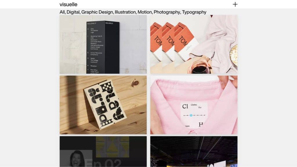
What Are the Features of the Visuelle Blog Design?
The Visuelle blog has a simple design, but it’s not obvious that it includes blog posts.
You have to hover your mouse over each post to view the topic and click on it.
At the top of the blog page, you can click on categories to narrow your results.
The individual blog posts have text, images, and videos, so you can use whatever media you choose.
Which Niche Is the Visuelle Design a Fit For?
The Visuelle design will fit visual blog niches the best, such as design or photography.
While you can add text, the typography isn’t the best to read for long periods.
However, it’s an excellent option to showcase your own work as a designer.
Then, you can use it to market your services or products.
Is It Easy to Use the Visuelle Design?
Using the Visuelle design can be easy if you choose the right template.
It’s unclear what template the blog uses or if it uses a custom theme.
Either way, you may need to do your own customizations.
That way, you can make the main blog page more visual.
5. Jules
Jules, also known as Sincerely Jules, is a fashion and lifestyle blog.
It’s an excellent resource to use as inspiration if you want to create something similar.
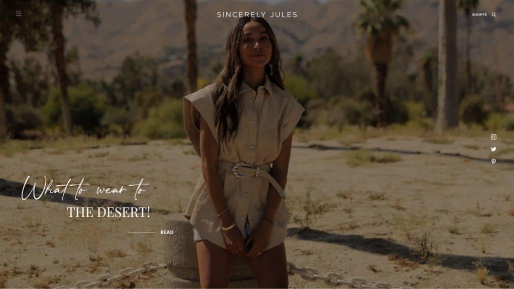
What Are the Features of the Jules Blog Design?
The Jules blog design features a recent post at the top of the main page.
There are also a few social media share buttons to help readers promote the content.
As you scroll down, you’ll see other posts with links to read as well as a preview of the photos.
That makes it a great option for people to browse posts without clicking on them.
Which Niche Is the Jules Design a Fit For?
The Jules design is a fit for any fashion or lifestyle blog.
It can also work for other blogs that use a lot of photos, such as a travel blog.
While there aren’t categories you can filter through, the posts are all related.
So you can click on each one to read.
Is It Easy to Use the Jules Design?
The Jules design may not be the easiest for beginners to use.
For one, it involves a lot more design than many blogs.
You will probably need to customize your layout significantly to emulate this blog.
But once you do, you can add posts easily.
6. Mirador
Mirador is a blog that curates graphic design work from people all over.
Designers can submit their work to add to the blog, and you can use it to inspire your blog design.
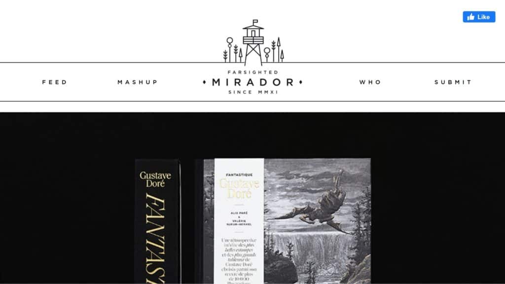
What Are the Features of the Mirador Blog Design?
The Mirador blog design is simple and serves as the website homepage.
Posts all appear in a single column, and you scroll down to find the next post.
Since the blog features graphic design, the posts don’t have a ton of text.
When they do, the font is a bit small, which can make it harder for people to read.
Which Niche Is the Mirador Design a Fit For?
The Mirador design is best for other visual blogs.
If you plan to use a lot of text, you may need to customize the font size to help your readers.
Otherwise, you can get away with smaller text.
Then, your readers will be able to spend more time viewing any images that you add.
Is It Easy to Use the Mirador Design?
Using the Mirador design can be easy, especially once you set it up.
You don’t have to worry about creating a blog page.
Instead, you can add posts, and you don’t need to design a sidebar.
But that doesn’t mean your readers may have trouble finding the posts they want.
7. Abduzeedo
Here’s what you should know about the Abduzeedo blog.
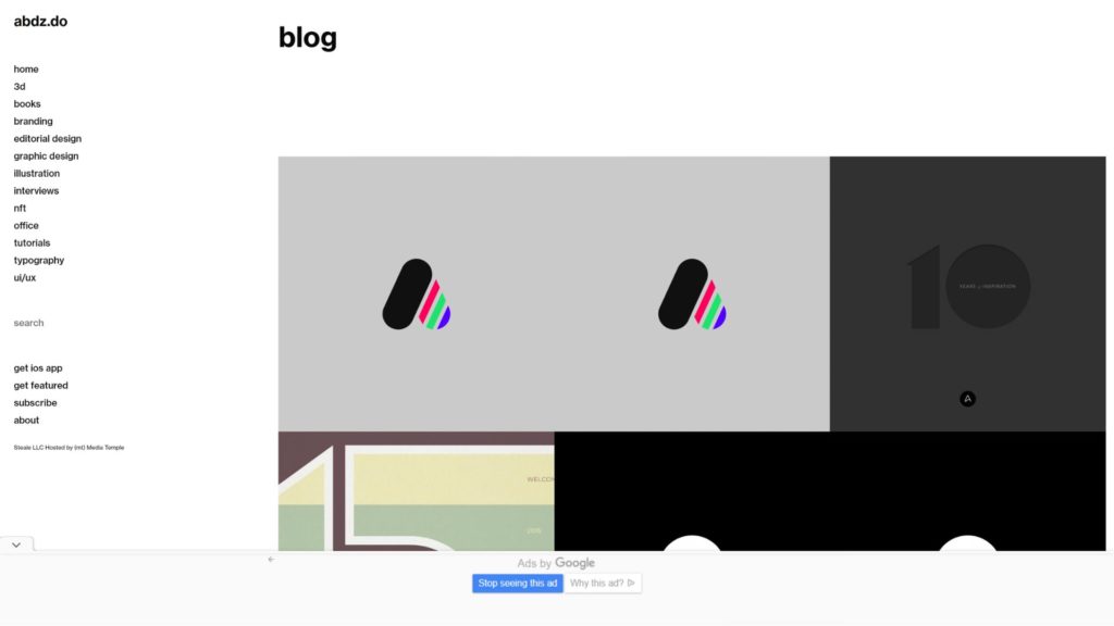
What Are the Features of the Abduzeedo Blog Design?
The Abduzeedo blog features a sidebar on the left side of the screen.
That’s where you’ll find the navigation bar with categories and a search bar.
Meanwhile, the blog posts all lay in a grid, with three posts per line.
Unfortunately, you can’t know the topic until you click on a blog post because the page just shows images.
Which Niche Is the Abduzeedo Design a Fit For?
The Abduzeedo design is a fit for any blog that wants easy navigation.
You can use a sidebar to share whatever you want.
However, it’s not the best fit for bloggers who don’t include titles in their featured images.
Your readers might not like clicking on multiple posts to learn what each covers.
Is It Easy to Use the Abduzeedo Design?
Using the Abduzeedo design can be easy once you set everything up.
However, it may be hard to customize the template to get the look just right.
8. Eye Magazine
Eye Magazine is another website where you can get some blog design inspiration.
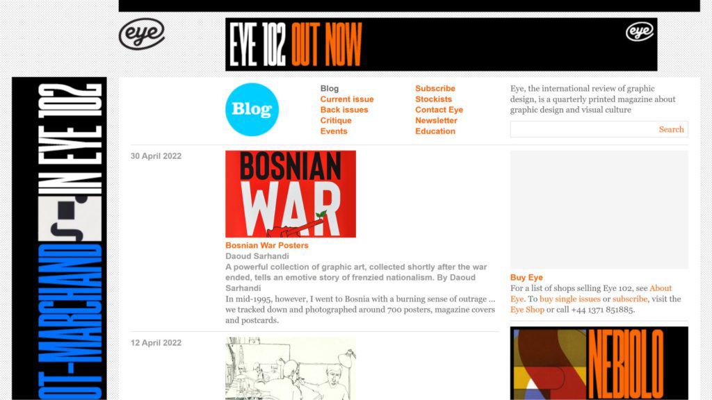
What Are the Features of the Eye Magazine Blog Design?
The Eye Magazine blog features categories that you can choose from at the top of the screen.
There’s also a search bar to help you find a specific post.
In the center, blog posts appear one by one with feature images and their post dates.
You can also use the sidebars to display ads or more blog information.
Which Niche Is the Eye Magazine Design a Fit For?
The Eye Magazine design is a great fit for almost any niche.
It’s particularly useful for blogs that act like online magazines.
Is It Easy to Use the Eye Magazine Design?
Using the Eye Magazine design can be easy.
Like any other blog design, it may take time to get used to the features, but you can learn to use them eventually.
9. Browser London
Consider using the Browser London blog to inspire your blog’s layout.
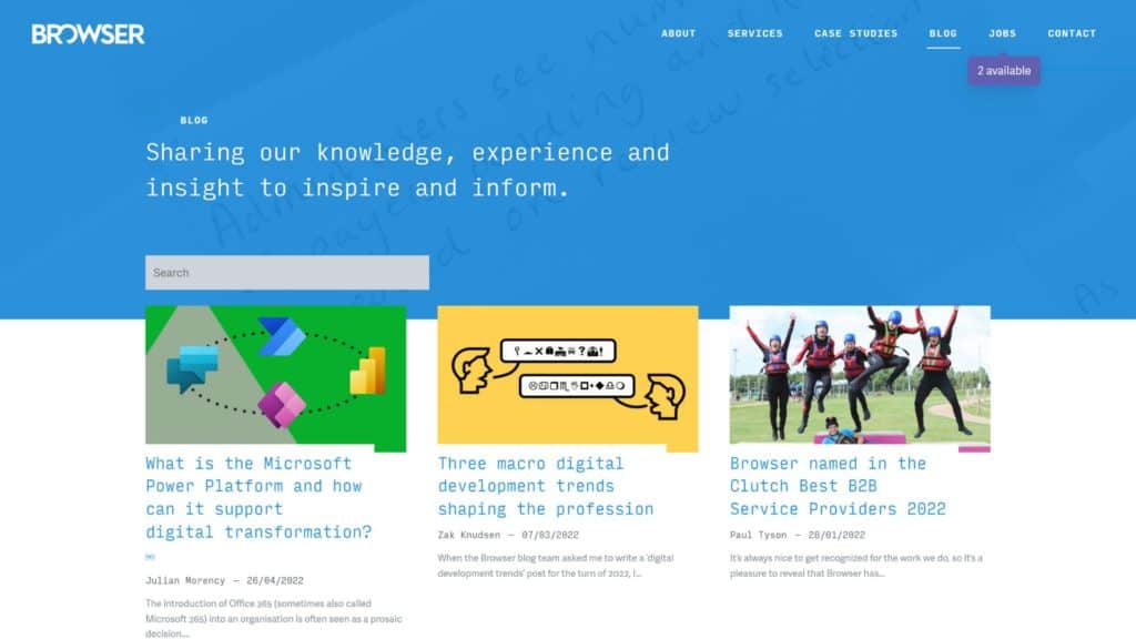
What Are the Features of the Browser London Blog Design?
The Browser London blog showcases posts in two columns.
Each post preview includes an image and a short snippet of the content.
Readers can use the search bar at the top to find something more specific.
Inside a blog post, it will show related posts on the side to help readers navigate the site.
Which Niche Is the Browser London Design a Fit For?
The Browser London design is a good fit for most niches.
If you have an image and want to preview the text, you should use this template.
Is It Easy to Use the Browser London Design?
Using the Browser London design is relatively easy.
You just need to create some categories and add images to each of your posts.
Why Is Blog Design Important?
Consider why you need good blog design and how it can help you.
Good blog design can make or break the user experience.
If your blog has a good design, it will be easier for people to navigate.
Reading posts will also be more enjoyable, so you can get recurring blog visitors.
What Are the Biggest Blog Design Mistakes?
The biggest blog design mistakes include using big walls of text.
While this is more of a writing thing, you should use shorter paragraphs when crafting posts.
Visual clutter is also a big mistake and can take away from a reader’s experience.
You should also make sure to include categories and a search bar to help people find specific topics.
Wrapping Up
Blog design is essential for getting and retaining traffic on your site.
Whether you want to use your blog for business or another purpose, appearance is everything.
Check out a few examples of good blog designs to help inspire you.

